Causal Inference
Introduction
Causal Inference is an analysis that uncovers the independent, actual effect of a certain action on an outcome. In other words, the goal of causal analysis is to explain whether a change in treatment variables actually causes changes to response variables (the outcome).
Traditionally, the standard approach to finding causal effects is Randomized Controlled Trials (aka A/B testing). However, RCTs are often expensive, time-consuming, and potentially unethical.
Actable AI’s Causal Inference analysis, which uses the latest technologies from Causal AI, helps uncover causal effects from observational data (i.e. data doesn’t have to be randomized) and makes it as simple as training a Machine Learning (ML) model without programming.
In order to avoid biases due to spurious correlations, the causal analysis algorithm first disassociates the common causes (also known as confounders) from both the given treatment variables and the outcome variable. It then finds the association between the disassociated treatment and outcome variables. This process is done using Double Machine Learning, which first generates two predictive models (to predict the outcome from the confounder variables, and to predict the treatment from the confounders), that are then combined to create a model of the treatment effects. More information can also be viewed in the glossary.
To run a Causal Inference analysis, a dataset where each row contains values of the treatment, outcome and all common causes is required.
Parameters
Treatment: The variable that causes the effect of interest. It can be either numeric, Boolean, or categorical.
Outcome: This is the variable on which we want to measure the causal effects of treatment. It can be either numeric, Boolean, or categorical.
Common Causes (optional): Common causes are also known as confounders. These are variables that have a causal effect on both the treatment and the outcome. It is important to include all common causes, or the selected common causes must satisfy the backdoor criterion for causal effect estimation to be correct. The backdoor criterion is used to measure the direct effect of one variable on another, by keeping any direct paths between the variables intact while blocking any and all spurious effects on these variables.
Effect Modifier (optional): This is a special common cause variable that affects the estimation of causal effects. If selected, a Conditional Average Treatment Effect (CATE) conditioned by this variable will be estimated instead.
Treatment control (optional): Treatment value for control group. For example, this could represent a placebo.
Positive Outcome Value (optional): If the Outcome is not of type DOUBLE, this optional parameter can be set. The chosen value is treated as ‘1’ (positive) while the rest are treated as ‘0’ (negative).
Filters (optional): Set conditions on columns (features) so as to remove any samples in the original dataset which are not required. If selected, only a subset of the original data is used.
Furthermore, if any features are related to time, they can also be used for visualization:
Time Column: The time-based feature to be used for visualization. An arbitrary expression which returns a DATETIME column in the table can also be defined, using format codes as defined here.
Time Range: The time range used for visualization, where the time is based on the Time Column. A number of pre-set values are provided, such as Last day, Last week, Last month, etc. Custom time ranges can also be provided. In any case, all relative times are evaluated on the server using the server’s local time, and all tooltips and placeholder times are expressed in UTC. If either of the start time and/or end time is specified, the time-zone can also be set using the ISO 8601 format.
Result View
There are four tabs containing the results of the Causal Inference analytic, as follows:
Treatment effect: This display illustrates how treatment affects outcome, with the value grouped by effect modifier if chosen. We will cover how to interpret this graph in the Case Study section.
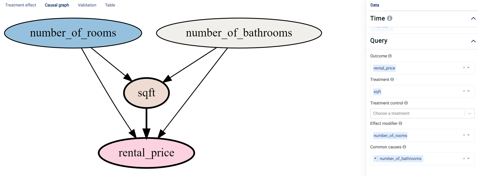
Causal Graph: A Directed Acyclic Graph (DAG) that visualizes the parameter choices based on the user’s selection of treatment, outcome, common cause, and effect modifier variables. A DAG (an example of which is shown in the image below) can be interpreted as follows:
An edge represents causality between variables.
Blue represents the Effect modifier variables.
Yellow/brown represents the Treatment variables.
Gray represents the Common causes variables.
Red represents the Outcome variable.
Validation: Shows the performance of the double machine learning algorithm acquired on the validation data, namely for the model used to predict the treatment (using the accuracy metric) and the model used to predict the outcome (using the R-squared (R2) metric). The importance of the selected common causes and a residual plot showing the differences between the actual and predicted values (for both the outcome and treatment variables) are also shown.
Table: Displays the first 1,000 rows in the original dataset and the corresponding values of the columns used in the analysis.
Case Study
Suppose we are a real estate agent and we would like to put more properties on the market. We’d like to understand what affects our rental price, and how it is affected.
An example of the dataset could be:
number_of_rooms |
number_of_bathrooms |
sqft |
location |
days_on_market |
initial_price |
neighborhood |
rental_price |
|---|---|---|---|---|---|---|---|
0 |
1 |
484,8 |
great |
10 |
2271 |
south_side |
2271 |
1 |
1 |
674 |
good |
1 |
2167 |
downtown |
2167 |
1 |
1 |
554 |
poor |
19 |
1883 |
westbrae |
1883 |
0 |
1 |
529 |
great |
3 |
2431 |
south_side |
2431 |
3 |
2 |
1219 |
great |
3 |
5510 |
south_side |
5510 |
1 |
1 |
398 |
great |
11 |
2272 |
south_side |
2272 |
3 |
2 |
1190 |
poor |
58 |
4463 |
westbrae |
4123.812 |
Causal inference analysis is able to describe the outcome change contributed by a continuous value change or a categorical value change. We are going to use the following example to demonstrate how to interpret the resultant graphs and results.
Categorical
Note
This example is available in the Actable AI web app and may be viewed here.
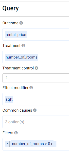
As a real-estate expert, experience might indicate that the location of a property affects the rental price. In the example dataset, the location feature contains categorical data where the values can be poor, good, or great. The number of rooms (number_of_rooms) and the property size (sqft) might affect the rental price, but the property size might also influence the number of rooms. To determine the effect of the number of rooms on the rental price, sqft should thus be set as a common cause, as follows:
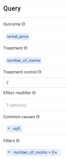
As can be observed, the outcome (target) variable is set to the rental price (rental_price), using the number of rooms (number_of_rooms) as the treatment variable and using 2 rooms as a control. This means that other values for the number of rooms will be compared against a value of 2 rooms. Moreover, a filter has been set to include only apartments having at least 1 room (thereby excluding potentially erroneous data or cases where there is only barren land without any buildings, which are not within our interest). Finally, the property size (sqft) has been set as a common cause that may affect both the outcome and predictor (treatment) variables.
The result provided by Actable AI in the Treatment effect tab is as follows:
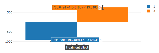
It is clearly shown that the number of rooms influences the rental price. Using 2 rooms as a baseline, the rental price decreases by an average of 911.58 (+/- 93.49) when an apartment only has 1 room, while it increases by an average of 755.65 (+/- 113.82) when an additional room is present.
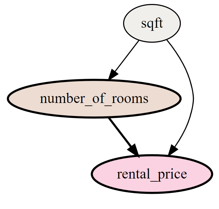
Switching to the Causal graph tab, the causal relationships among the chosen features is depicted (namely that the property size affects both the rental price and number of rooms, while the latter also influences the rental price).
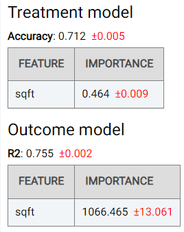
The Validation tab shows the performance of the double machine learning algorithm, namely for the model used to predict the treatment (using the accuracy metric) and the model used to predict the outcome (using the R-squared (R2) metric). The importance of the selected common causes (sqft in this case) is also shown:
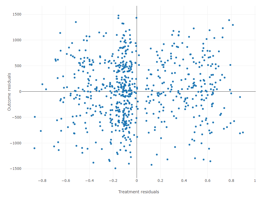
A residual plot showing the differences between actual and predicted values for both the outcome and treatment variables is also shown:
Numerical
Note
This example is available in the Actable AI web app and may be viewed here.
We are also curious about how the rental price (rental_price) changes with respect to the property size (sqft) for a given number of rooms. In order to do this, we need to use Effect Modifiers.
We can set up the analysis as follows:
As can be observed, the outcome is again set to the target_price and the number of rooms (number_of_rooms) is used as the treatment variable with 2 rooms as the control value.
In the Treatment effect tab, two figures are now shown:
A line graph, indicating the average change in the outcome across values of the effect modifier, for different values of the treatment variable. The 95% confidence interval is also shown. In this example, it can be seen that the rental price increases for larger property sizes, and it can once again be observed that a property with three rooms generally tend to have higher rental prices than properties with one or two rooms. However, at a
sqftvalue below 550, a property with three rooms can actually have a lower rental price than an apartment with two rooms. Moreover, for properties that are even smaller, the rental price may be similar to that of properties having just one room. This is probably because a higher number of rooms in smaller properties means that the rooms may be quite small and cramped, and thus less desirable.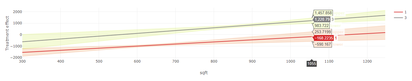
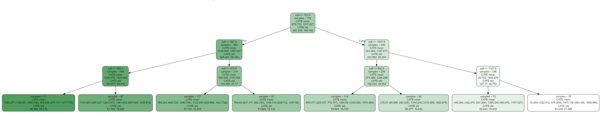
A binary tree (an example of which is shown below), which tells us how our data is distributed. Each node contains the following information:
Condition boundary: For the selected numeric effect modifier (
sqftin our example), this represents the boundary value that splits the data. The node can have two children, where the left child considers the case when the condition is met (‘True’) whereas the right child considers the case when the condition is not met (‘False’).Samples: The size of the sample in this segment. It helps to provide an understanding as to how our data is distributed given the effect modifier changes.
CATE: The Conditional Average Treatment Effect. The Average Treatment Effect (ATE) can be used as compare treatments in randomized experiments, with CATE being computed on subgroups of samples. The subgroup is defined by the samples’ attributes or attributes of the context in which the experiment occurs. The mean and std (standard deviation) describe the subgroup via the coefficient between effect modifier and outcome. By comparing the mean value, one can get an understanding of the severity of the effect modifier’s impact on the outcome. The standard deviation can be used to get the confidence about the stability of the subgroup samples.
The results shown in the Causal graph tab, Validation tab, and Table tab are similar to those in the ‘Categorical’ case above.