Regression
Introduction
A regression analysis predicts a continuous value based on other variables. For example, a regression analysis can be used to predict house prices based on their size (occupied area), number of rooms, and their locations.
It works by training/evaluating a Machine Learning (ML) model with labeled data and generating predictions for unlabeled data. To build a regression model, a training data set is required with feature values (predictors) and labeled target values. Each row in the data set contains a list of features \(f1, f2, \ldots , fn\) and a target \(t\). Each feature should be a numerical, categorical, text or a DATETIME value. If a feature comprises a list of things, rather than a single value (for example a list of jobs), each element in the list should be split into different features (e.g. job1, job2, etc.) instead. The target values should be numerical (with a large number of unique values).
If you want to generate predictions after training, append unlabeled rows to the labeled rows and save them in a file or a database table. After uploading your file or connecting to your database, you can use the data table as a data source for training/prediction. You can also generate predictions with a live model/API after the model is trained and deployed. More details will be given hereunder.
Parameters
There are four tabs containing options that can be set: the Data tab, Advanced tab, Hyperparameters tab, and Intervention tab, as follows:
Data tab:
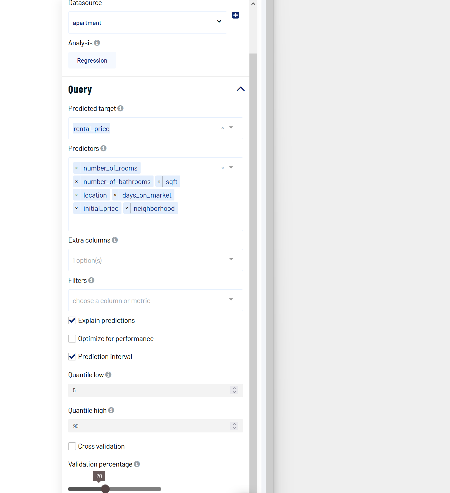
Predicted target: Choose one column for which any missing values should be predicted.
Predictors: Columns that are used to predict the predicted target.
Explain predictions: If selected, a Shapley value shall be displayed for each predictor and for each prediction. More information will be given below.
Extra columns: If selected, the values of these columns are shown along the results but aren’t used for training and prediction.
Training time limit: The maximum amount of time used for training. This is a rough estimation and the actual training time could be longer than the set value. A value of 0 represents no limit.
Causal features selection: If set, all features that are found to be correlated or indirectly causal to the target are removed. The remaining features are potentially directly causal when all their confounders with the target are included in the predictors.
Cross validation: If selected, instead of splitting the input data into training and validation sets, the data is split into a number of folds. One fold is used for validation and the rest of the folds are used for training, with this process repeated such that each fold is used for validation. The validation results are aggregated over the validation results of all folds. When refit full is selected, the final model is the model trained with the entire input data set. When refit full is not selected, the final model is an average prediction from an ensemble of all trained models.
Optimize for quality: If selected, Actable AI tries to train a model that optimizes for performance. This usually takes a lot longer to finish.
Validation percentage: When cross validation is not selected, the data is split into training and validation sets. The model is trained with the training set and is validated (tested whilst performing training) with the validation set. By sliding this value, one can control the percentage of rows with a non-empty predicted target that is used for validation.
Prediction interval: If selected, the model will return a prediction interval instead of a point estimation. Setting the low and high quantile values enables the model to return values in the given confidence range. Two new columns are appended, one of which indicates the lower bound value while the other indicates the upper bound value.
Quantile low: Used to calculate the lower bound of the prediction interval.
Quantile high: Used to calculate the upper bound of the prediction interval.
Sensitive Groups (optional): Groups that contain sensitive information and need to be protected from biases.
Proxy features: Features that might contain biases and need to be de-biased to protect the Sensitive Groups.
Refit full: If selected, the final (served) model is re-trained with the entire data set after validation. Note that it means the final model can be a different model from the selected one shown in the validation.
Filters (optional): Set conditions on columns (features), in order to remove any samples in the original dataset which are not required. If selected, only a subset of the original data is used in the analytics.
Furthermore, if any features are related to time, they can also be used for visualization:
Time Column: The time-based feature to be used for visualization. An arbitrary expression which returns a DATETIME column in the table can also be defined, using format codes as defined here.
Time Range: The time range used for visualization, where the time is based on the Time Column. A number of pre-set values are provided, such as Last day, Last week, Last month, etc. Custom time ranges can also be provided. In any case, all relative times are evaluated on the server using the server’s local time, and all tooltips and placeholder times are expressed in UTC. If either of the start time and/or end time is specified, the time-zone can also be set using the ISO 8601 format.
Note
The Sensitive Groups field, the Explain predictions option, the Optimize for quality option, and the Prediction interval option are incompatible with each other. Hence, if any one of these options is utilized, the other options are made unavailable.
Advanced tab:
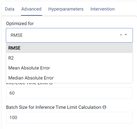
The metric used for optimization can be selected from the drop-down menu. Metrics include the Root Mean Squared Error (RMSE), R-Squared (R2), Mean Absolute Error (MAE), and the Median Absolute Error.
Feature Pruning (optional): If selected, features that are redundant or negatively impact a model’s validation results are removed.
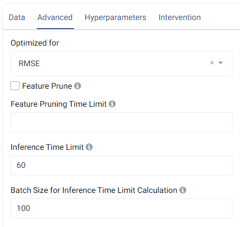
Inference Time Limit: The maximum time it should take, in seconds, to predict one row of data. For example, if the value is set to 0.05, each row of data takes 0.05 seconds (=50 milliseconds) to process. This is also equivalent to a throughput of 20 rows per second.
Batch Size for Inference Time Limit Calculation: This parameter corresponds to the amount of rows (passed at once) to be predicted when calculating the per-row inference speed. A batch size of 1 (online inference) is inefficient due to a fixed cost overhead (regardless of data size). Consider increasing the batch size, such as setting it to 10,000, for better performance when processing test data in larger chunks.
Hyperparameters tab:
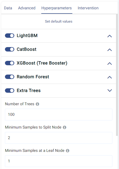
This tab shows all the models that can be trained for regression. They can each be enabled o disabled by clicking on the toggle, and the individual options of each model can also be set.
The default values normally give satisfactory results, but these settings can be tweaked and adjusted to improve performance or adapt the model to any other constraints.
Intervention tab:
Counterfactual analysis can be performed to determine the effect of a treatment variable on the predicted outcome by setting the following two fields:
Current Intervention: Variables that cause the effect of interest, a.k.a. the current treatment affecting the outcome. It can be either numeric, Boolean, or categorical.
Common causes: Also known as confounders, these are variables that may affect both the treatment and the outcome variables. Selecting good common causes can help improve the results. Columns that have an effect on both the target and the current intervention should be included in this field.
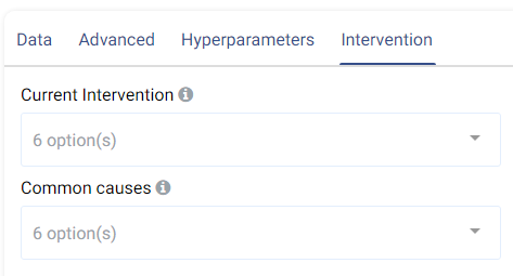
A more in-depth analysis can also be made using Actable AI’s Counterfactual Analysis function.
Case Study
Note
This example is available in the Actable AI web app and may be viewed here.
Imagine we are a real estate company and would like to forecast rental prices for properties that remain on the market. An example of the dataset could be:
days_on_market |
initial_price |
location |
neighborhood |
number_of_bathrooms |
number_of_rooms |
sqft |
rental_price |
|---|---|---|---|---|---|---|---|
10 |
2271 |
great |
south_side |
1 |
0 |
4848 |
2271 |
1 |
2167 |
good |
downtown |
1 |
1 |
674 |
2167 |
19 |
1883 |
poor |
westbrae |
1 |
1 |
554 |
1883 |
3 |
2431 |
great |
south_side |
1 |
0 |
529 |
2431 |
58 |
4463 |
poor |
westbrae |
2 |
3 |
1190 |
4123.812 |
Now we added some new properties and would like to find out how much is the rental price for their condition, they are
days_on_market |
initial_price |
location |
neighborhood |
number_of_bathrooms |
number_of_rooms |
sqft |
rental_price |
|---|---|---|---|---|---|---|---|
18 |
1725 |
poor |
westbrae |
1 |
0 |
509 |
|
49 |
1388 |
poor |
westbrae |
1 |
0 |
481 |
|
1 |
4677 |
good |
downtown |
2 |
3 |
808 |
|
30 |
1713 |
poor |
westbrae |
1 |
1 |
522 |
|
10 |
1903 |
good |
downtown |
1 |
1 |
533 |
We set our parameters as follows:
Suppose that we are a health insurance company, and we would like to estimate costs associated with customers’ health care. This would help to ensure that the revenue is higher than the medical care costs of beneficiaries, in order to generate profit.
While some conditions are common in certain segments of the population, medical costs can be difficult to predict because most of the expenses are related to rare conditions. In this use case, we will attempt to predict the medical care costs for each individual.
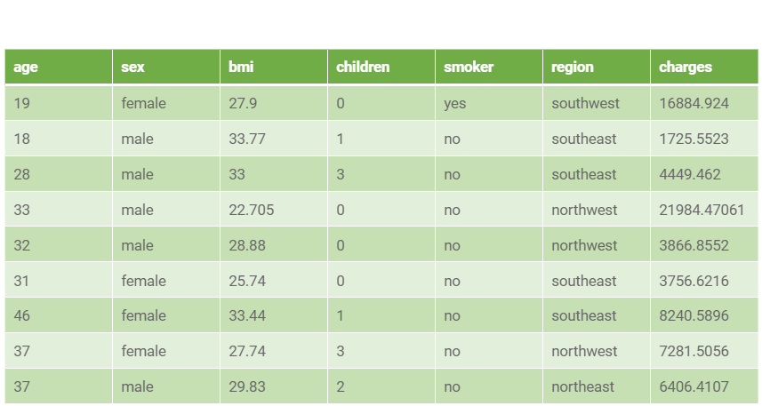
An example of the dataset could contain information on individuals’ age, sex, Body Mass Index (BMI), number of children, smoking habits, and costs claimed in a year:
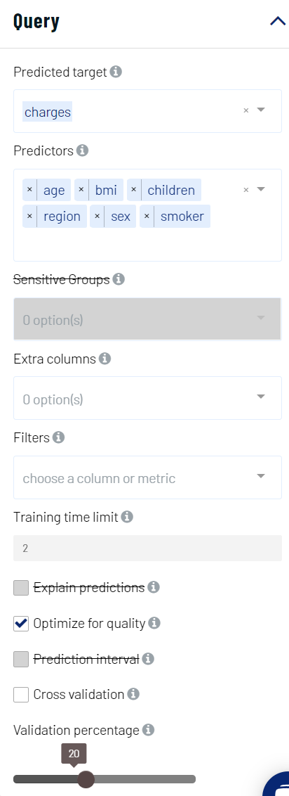
We set our parameters in Actable AI as follows:
Review Result
The result view contains the tabs Prediction, Performance, PDP/ICE, Leaderboard, Table, Live Model, and Live API, as follows:
Prediction
The Prediction tab shows the prediction result for the rows where the target value was missing.
If Prediction interval was set, the table also has two additional columns: <target>_low and <target>_high, where <target> is the name of the target feature.
If Explain predictions was set, each predicted row also contains a Shapley value. This will be covered in more detail when the Details table is explained.
Performance
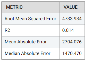
The Performance tab shows the performance of our model using a number of metrics, namely the Root Mean Squared Error (RMSE), R-Squared (R2), Mean Absolute Error (MAE), and the Median Absolute Error, as follows:
Actable AI does not only act as a model training tool, but also attempts to provide the rationale behind the classification. To this end, two tables are provided: the Important Features table and the Details table.
The Important Features table indicates the importance of the features (columns in the data) as deduced by the Actable AI algorithms during training. In our case study example,
smokeris by far the most important feature with the highest weight in making a prediction (9495.790). This is understandable, since it is well-known that smoking may cause numerous health-related issues. The p-value is also shown, which can be used to help determine if the null hypothesis should be rejected, with smaller values increasing the likelihood that the null hypothesis is rejected. The null hypothesis represents the case that there exist no statistically significant differences between two possibilities. In the feature importance table, lower p-values increase the certainty that the feature importance values are correct.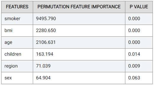
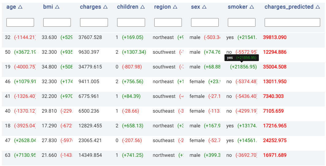
The Details table shows the predicted values, and indicates the rationale behind the predicted value made in each row if Explain predictions is enabled. This option also shows Shapley values for each predictor feature. If the Prediction interval option is selected, two additional columns are also created. More specifically, the Details table includes the following:
Prediction result: the column
<target>_predictedcontains the result of the predicted target, where<target>is the name of the target feature.Prediction interval columns: if the Prediction interval option is selected, there are two new columns named using the format
<target>_lowand<target>_high, where<target>is again the name of the target feature. The value can be interpreted as follows: given a quantile low value of X and a quantile high value of Y, there is X% chance that the prediction value can be lower than the<target>_lowboundary, and Y% chance that the prediction value can be larger than the<target>_highboundary.
Moreover, the values to the right of each cell belonging to a predictor are Shapley values, which indicate the contribution of a feature to the final outcome. Values in red indicate that the feature decreases the probability of the predicted class (i.e. the highest probability) by the given amount, while values in green indicate that the effect of the feature increases the probability of the predicted class by the given amount.
In the image below, the person in the third row is predicted to accumulate $35,004.51 in charges, which is quite close to the actual value of $34,779.62. According to the Shapley values, the fact that the person is a smoker increased the predicted charges by $21,856.95 (compared to the predicted charge if the person was not a smoker). On the other hand, the person in the second row is a smoker, which reduced the predicted charges by $5,572.95 (compared to the charges if the person had been a smoker).
Note
Hovering the mouse cursor over cells containing long text that is hidden will make the hidden text visible, as shown in the above image.
PDP/ICE
Partial Dependence Plots (PDP) are powerful visualization tools that help you understand how specific features in our model influence its predictions. With PDP, you can easily explore how changing one feature impacts the outcome while keeping all other factors constant. More information can be found in the glossary.
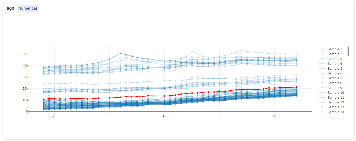
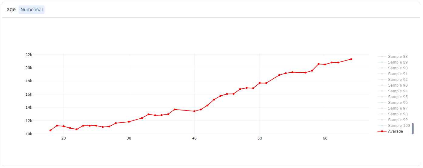
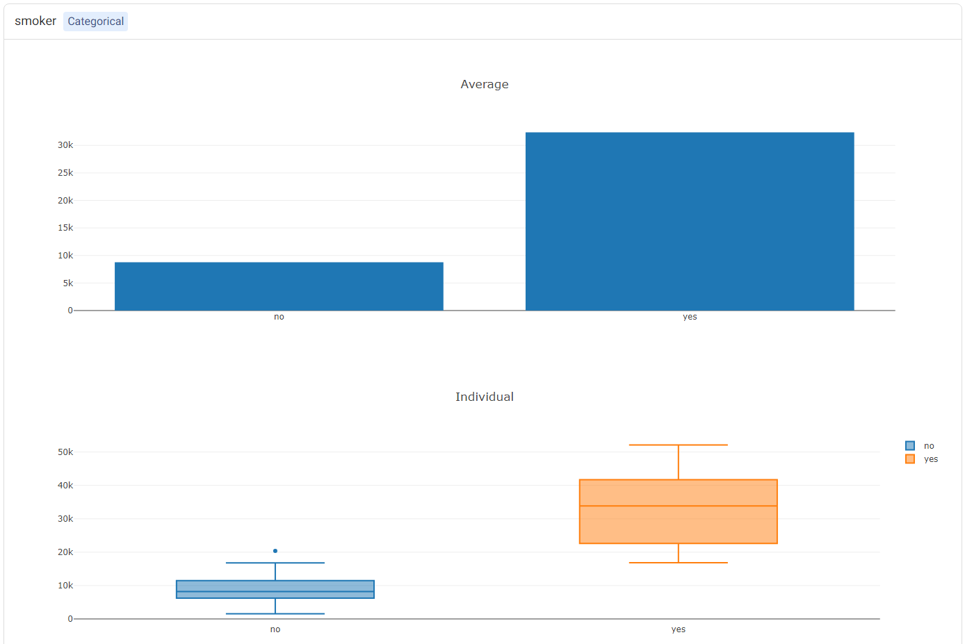
Individual Conditional Expectation (ICE) plots complement the insights gained from PDP. While PDP gives an average view of the relationship between a feature and the predicted outcome, ICE plots enable the selection of a specific data point to observe how changing one feature impacts the prediction for that unique instance. In this example, each instance represents one patient. Hence, this enables us to see how the costs change when a factor such as their age varies, keeping all other factors unchanged. More information can be found in the glossary.
Note
Only a subset of all samples may be shown in the ICE, if there is a large number of samples. This is done to reduce computational resources and make it easier to view the plots.
The PDP and ICE plots are provided for each feature. For ‘numerical’ features (such as age), there is one plot containing (1) a line for each sample (representing the ICE plots), and (2) a red line representing the ‘average’ (i.e. the PDP).
Tip
Double-clicking on any of the labels in the legend will hide the rest of the labels. For example, double-clicking on ‘Average’ (corresponding to the PDP) shows only the PDP.
For categorical features (such as smoker), two plots will be shown: (1) a bar plot, showing the ‘average’ values (i.e. the PDP plot), and (2) a box plot showing statistics of the ICE values.
Leaderboard
The Leaderboard tab shows the models used to obtain the predictions of the target variable. Actable AI uses state-of-the-art machine learning algorithms to obtain predictions, and then selects the best model out of those considered to yield the final predicted values.
In the table below, the following information is available:
Model: The name of the model trained.
Root Mean Squared Error: The validation score of the model, in terms of the Root Mean Squared Error (RMSE). If another metric was used for optimization in the Advanced options tab (as detailed above), then this column will correspond to the chosen metric. By default, models are sorted using this metric (with the first model being the best-performing model), but they may also be ranked using the other columns by clicking on the arrows next to the name of each column (which toggle between sorting the values in ascending or descending order).
Training Time: The time taken to train the model.
Prediction Time: The time taken by the model to generate the predictions.
Hyperparameters: The hyperparameters used to train the model.
features: The features used by the model in performing predictions. This is particularly useful if Feature Pruning is enabled, to determine which features are actually used by the model in making predictions.

Table
The Table tab displays the first 1,000 rows in the original dataset.
Live Model
The best trained model can be used on new data, either using an uploaded dataset or by adding predictor feature values directly in a form.

Supplying the values in the form makes it easy and quick to compare the predicted outcomes when changing any of the feature values. For example, we could compare the predicted charges for a non-smoking person having a set of attributes (age, BMI, etc.), and predict the charges for the same person with identical attributes but changing the smoker feature from ‘no’ to ‘yes’:

Prediction of charges for a non-smoking 50 year-old male person with a BMI of 45, 2 children, and living in the ‘southeast’ region. The predicted charges amount to $11,108.88.

Prediction of charges for the same person in the previous image, but this time he is a smoker. Changing just the smoker attribute increased the predicted charges from $11,108.88 to $46,711.00.
The parameters in the Intervention tab (discussed above) and Actable AI’s Counterfactual Analysis can also be used to predict outcomes when one of the inputs is changed.
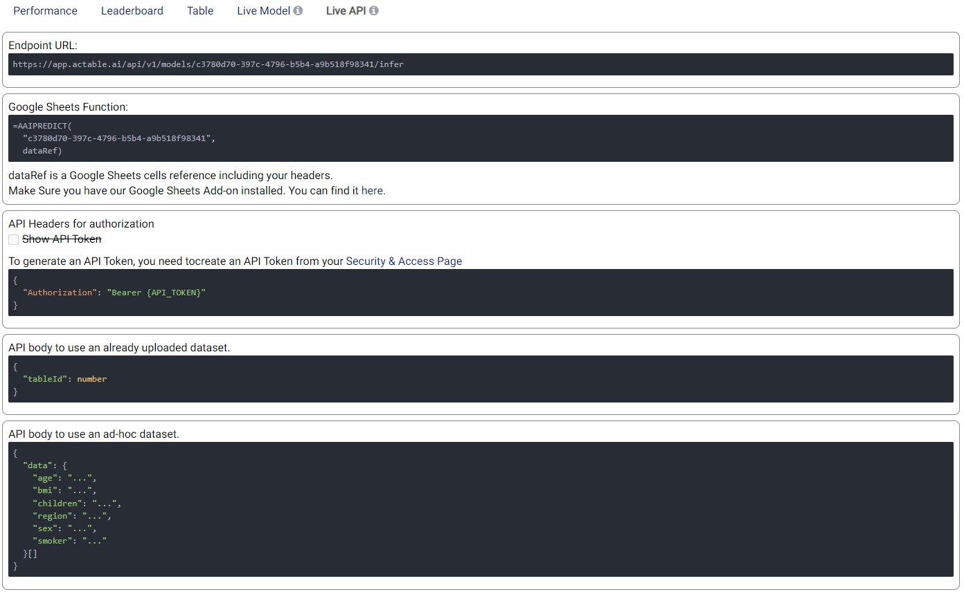
Live API
An API endpoint is also made available, allowing the generation of predictions in any of your existing applications (e.g. web app, mobile app, etc.). The available functionalities and details of the API are given in this tab, as shown in the example below:
