Time-series Forecasting
Introduction
A time-series forecast predicts future values of a time-series based on historical data. A data source for a time-series forecasting must have at least one column with the format yyyy-MM-dd (e.g. 2022-11-23) or standard datetime values yyyy-MM-dd HH:mm:ss (e.g. 2022-11-23 12:15:04).
Parameters
There are three tabs containing options that can be set: the Data tab, Advanced tab, and Customize tab, as follows:
Data tab:
Date time: The temporal column whose values are datetimes. The column value needs to have the DATETIME type.
Columns: The columns that should be forecast.
Warning
This analytic does not currently support categorical data. Hence, such data should not be included in Columns. However, we are working hard to enable support for categorical data in a future update.
Prediction length: How many future time steps to predict. It must be less than one-fourth (25%) of the length of the historical data.
Number of trials: The number of models to be trained. The best model based on validation data will be chosen to generate the final forecast. More trials usually result in a better forecast but take longer to train.
Tuning data: The method used to sample the data to be used for model tuning (ie. to derive the tuning data):
Random: Random parts of the time series are used.
Last: The last part of the time series is used.
Group by (optional): Group data by the specified column(s).
Additional features (optional): Features that may be used by some models to help with the prediction, but are not predicted themselves.
Filters (optional): Set conditions on columns (features) so as to remove any unrequired samples in the original dataset. If selected, only a subset of the original data is used in the analytics.
Time Column (optional): The time-based feature to be used for visualization. An arbitrary expression which returns a DATETIME column in the table can also be defined, using format codes as defined here.
Time Range (optional): The time range used for visualization, where the time is based on the Time Column. A number of pre-set values are provided, such as Last day, Last week, Last month, etc. Custom time ranges can also be provided. In any case, all relative times are evaluated on the server using the server’s local time, and all tooltips and placeholder times are expressed in UTC. If either of the start time and/or end time is specified, the time-zone can also be set using the ISO 8601 format.
Advanced tab:
The metric used for optimization can be selected from the drop-down menu. Metrics include the Mean Weighted Quantile Loss, Root Mean Squared Error (RMSE), and the Seasonal Error, among others.
Customize tab:
Color Scheme: Change the color scheme used to display the charts.
Legend: if selected, a legend will be displayed on the charts.
X Axis Label: The label to use for the \(x\)-axis.
Left margin: The number of pixels to apply for the left margin, which can allow more room for the \(x\)-axis labels.
Y Axis Label: The label to use for the \(y\)-axis.
Right margin: The number of pixels to apply for the bottom margin, which can allow more room for the \(y\)-axis labels.
Case Study
Note
This example is available in the Actable AI web app and may be viewed here.
Suppose we are a bike rental shop owner. We have our bike demand data for the last two years and we would like to predict the future demand.
An example of the dataset could be as follows:
temp |
hum |
windspeed |
casual |
registered |
cnt |
dteday |
|---|---|---|---|---|---|---|
0.344167 |
0.805833 |
0.160446 |
331 |
654 |
985 |
2011-01-01 |
0.363478 |
0.696087 |
0.248539 |
131 |
670 |
801 |
2011-01-02 |
0.196364 |
0.437273 |
0.248309 |
120 |
1229 |
1349 |
2011-01-03 |
0.2 |
0.590435 |
0.160296 |
108 |
1454 |
1562 |
2011-01-04 |
0.226957 |
0.436957 |
0.1869 |
82 |
1518 |
1600 |
2011-01-05 |
0.204348 |
0.518261 |
0.0895652 |
88 |
1518 |
1606 |
2011-01-06 |
0.196522 |
0.498696 |
0.168726 |
148 |
1362 |
1510 |
2011-01-07 |
0.165 |
0.535833 |
0.266804 |
68 |
891 |
959 |
2011-01-08 |
0.138333 |
0.434167 |
0.36195 |
54 |
768 |
822 |
2011-01-09 |
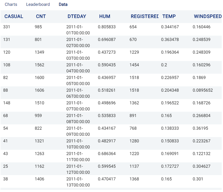
The data collected includes the daily temperature (temp), humidity (hum), wind speed (windspeed), daily casual customers (casual), daily registered customers (registered), number of daily rentals (cnt) and the date (dteday).
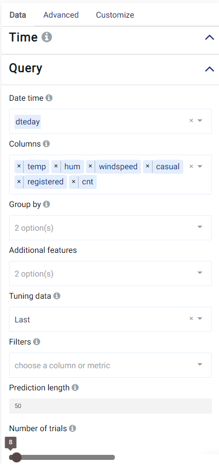
We set our parameters as follows:
Review Result
The result view contains the Charts, Leaderboard, and Data tabs. If using the Group by option, the Performance tab is also shown. More details for each tab will now be given.
Charts
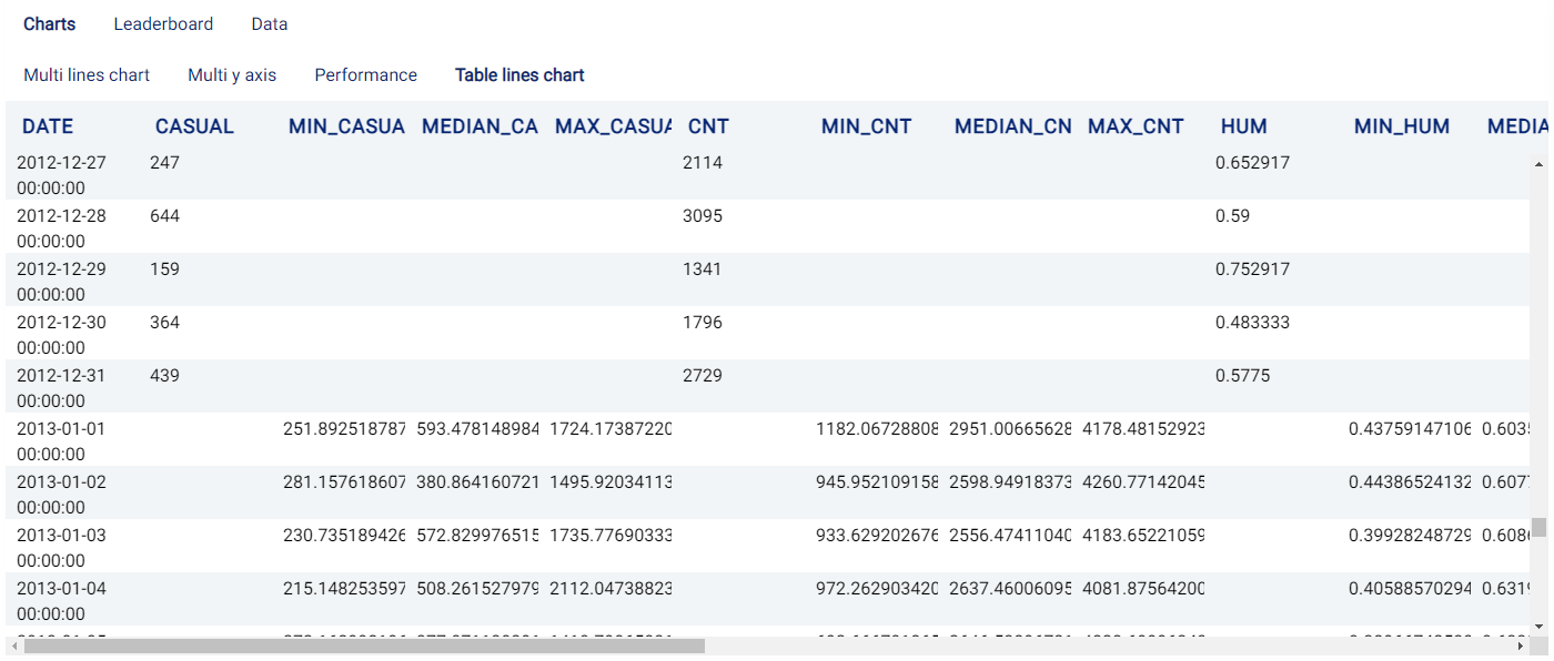
This tab contains an four sub-tabs: the Multi lines chart tab, Multi y axis tab, Performance tab (named Group performance when using the Group by option), Table lines chart tab and the Table tab.
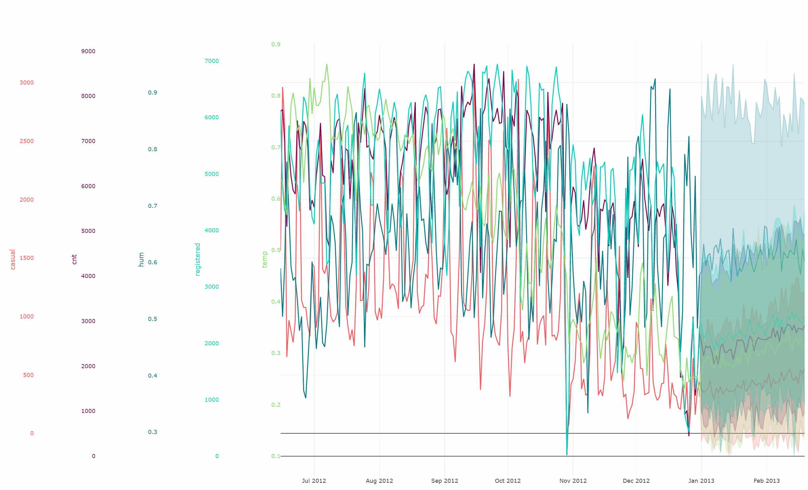
Multi lines chart: The Multi lines chart tab plots all selected Columns values on the same \(y\)-axis along with the given Date time as the \(x\)-axis. The plot also includes an additional 50 days of data because we set prediction length as 50.
Since we are primarily interested in understanding our future demand, including the daily casual customers (
casual), daily registered customers (registered) and number of daily rents (cnt), we can click on the unrequired features in the legend to hide them from view and de-clutter the chart and get a clearer view of the predicted result. Clicking on the name of a hidden line will bring it back into view on the chart, while double clicking will restore the original view (i.e. all lines are displayed).It can be observed that, for the prediction period, we not only display the forecasting number but also the possible range for the value. It is displayed as a confidence band in a lighter shade of the color used for the line.

Multi Y axis chart: Similar to the Multi lines chart tab which plots all selected Columns values, the Multi y axis plots all values in multiple y-axes without scaling them. The legend tool on the top right corner can again be used to hide/display variables.
Every axis scale and offset can be adjusted independently by pressing the mouse on the axis, or pressing at the bottom of the axis and dragging the mouse.
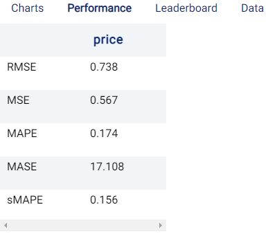
Performance/Group performance: This tab demonstrates how well the model is performing, by using the end period of the dataset as the validation data. Actable AI calculates several scores to evaluate the performance:
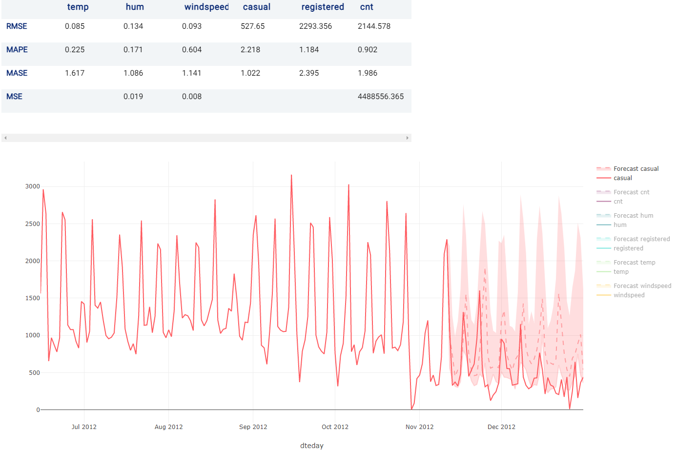
RMSE: Root Mean Squared Error. It is calculated as the square root of the second sample moment of the differences between the predicted and actual values.
MAPE: Mean Absolute Percentage Error. It is calculated as the average absolute percentage error for each time period minus the actual values divided by actual values.
MASE: Mean absolute scaled error. It is calculated as the mean absolute error of the forecast values, divided by the mean absolute error of the in-sample one-step naive forecast.
MSE: Mean Squared Error. It is calculated as the average squared difference between the estimated values and the actual value.
A chart showing the actual and forecasted values is also displayed, where any unrequired features can again be hidden from the chart.
When using the Group by option, results are grouped by the chosen feature. The results for the required group can be viewed by selecting the group from the drop down menu:
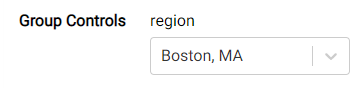
Table lines chart: The Table lines chart tab displays the values plotted in the Multi lines chart as a table.
Performance
This tab is visible when using the Group by option, and summarizes the validation performance across all groups considered using a number of metrics.
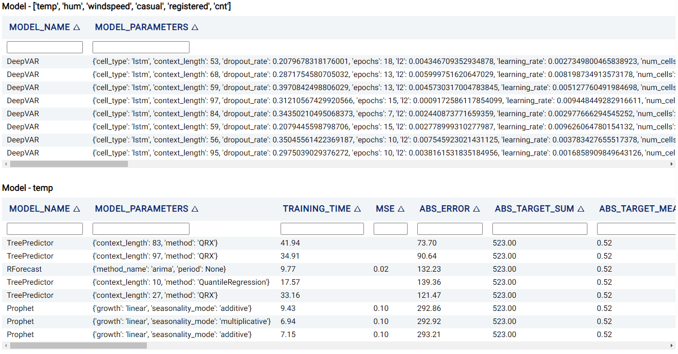
Leaderboard
The Leaderboard tab shows the models used to obtain the predictions of the target variables. Actable AI uses state-of-the-art machine learning algorithms to obtain predictions, and then selects the best model out of those considered to yield the final predicted values.
One table for each forecast variable is visible, with the following information:
Model_name: The name of the model trained.
Training Time: The time taken to train the model.
Model_parameters: The hyperparameters used to train the model.
A number of metrics are also shown across several columns, computed on the tuning data.
Data
The Data tab displays the first 1,000 rows in the original dataset and the corresponding values of the columns used in the analysis.