Classification
Introduction
Classification is used to predict categorical values (as opposed to predicting continuous variables as in the case of Regression). An example of classification is the case when credit card applications are categorized into different risk groups based on annual salary, outstanding debts, age, etc.
Classification works by training and evaluating a Machine Learning (ML) model with labeled data, and then generates predictions for unlabeled data. If you want to generate predictions after training, append unlabeled rows to the labeled rows and save them in a file or a database table. After uploading your file or connecting to your database, you can use the data table as a data source for training/prediction. You can also generate predictions with a live model/API after the model is trained and deployed. More details will be given hereunder.
Parameters
There are four tabs containing options that can be set: the Data tab, Advanced tab, Hyperparameters tab, and Intervention tab, as follows:
Data tab:
Predicted target: Choose one column for which any missing values are to be predicted.
Predictors: Columns that are used in predicting the target.
Extra columns: If selected, the values of these columns are shown along the results but aren’t used for training and prediction.
Training time limit: The maximum amount of time used for training. This is a rough estimation and the actual training time could be longer than the set value. A value of 0 represents no limit.
Explain predictions: If selected, Shapley values shall be displayed for each predictor and for each prediction. More information will be given below.
Optimize for quality: If selected, Actable AI tries to train a model that optimizes for performance. This usually takes a lot longer to finish.
Cross validation: If selected, instead of splitting the input data into training and validation sets, the data is split into a number of folds in a process known as cross validation. One fold is used for validation and the rest of the folds are used for training, with this process repeated such that each fold is used for validation. The validation results are aggregated over the validation results of all folds. When refit full is selected, the final model is the model trained with the entire input data set. When refit full is not selected, the final model is an average prediction from an ensemble of all trained models.
Validation percentage: When cross validation is not selected, the data is split into training and validation sets. The model is trained with the training set and is validated with the validation set. By sliding this value, one can control the percentage of rows with a non-empty predicted target that is used for validation.
Sensitive Groups (optional): Groups that contain sensitive information and need to be protected from biases.
Proxy Features: Features that need to be de-biased to protect the Sensitive Groups.
Filters (optional): Set conditions on columns to be filtered in the original dataset. If selected, only a subset of the original data is used in the analytics.
Furthermore, if any features are related to time, they can also be used for visualization:
Time Column: The time-based feature to be used for visualization. An arbitrary expression which returns a DATETIME column in the table can also be defined, using format codes as defined here.
Time Range: The time range used for visualization, where the time is based on the Time Column. A number of pre-set values are provided, such as Last day, Last week, Last month, etc. Custom time ranges can also be provided. In any case, all relative times are evaluated on the server using the server’s local time, and all tooltips and placeholder times are expressed in UTC. If either of the start time and/or end time is specified, the time-zone can also be set using the ISO 8601 format.
Note
The Sensitive Groups field, the Explain predictions option, the Optimize for quality option, and the Prediction interval option are incompatible with each other. Hence, if any one of these options is utilized, the other options are made unavailable.
Advanced tab:
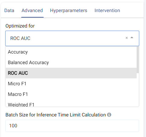
The metric used for optimization can be selected from the drop-down menu. Metrics include the traditional Accuracy along with other popular metrics such as Micro/Macro/Weighted F1, Micro/Macro/Weighted Precision, Micro/Macro/Weighted Recall, MCC, etc.
Feature Pruning (optional): If selected, features that are redundant or negatively impact a model’s validation results are removed.
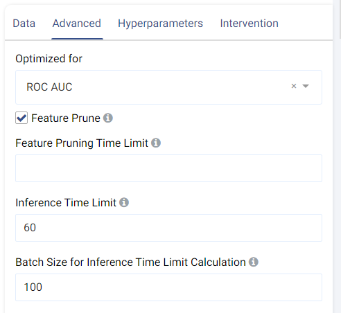
Inference Time Limit: The maximum time it should take, in seconds, to predict one row of data. For example, if the value is set to 0.05, each row of data takes 0.05 seconds (=50 milliseconds) to process. This is also equivalent to a throughput of 20 rows per second.
Batch Size for Inference Time Limit Calculation: This parameter corresponds to the amount of rows (passed at once) to be predicted when calculating the per-row inference speed. A batch size of 1 (online inference) is inefficient due to a fixed cost overhead (regardless of data size). Consider increasing the batch size, such as setting it to 10,000, for better performance when processing test data in larger chunks.
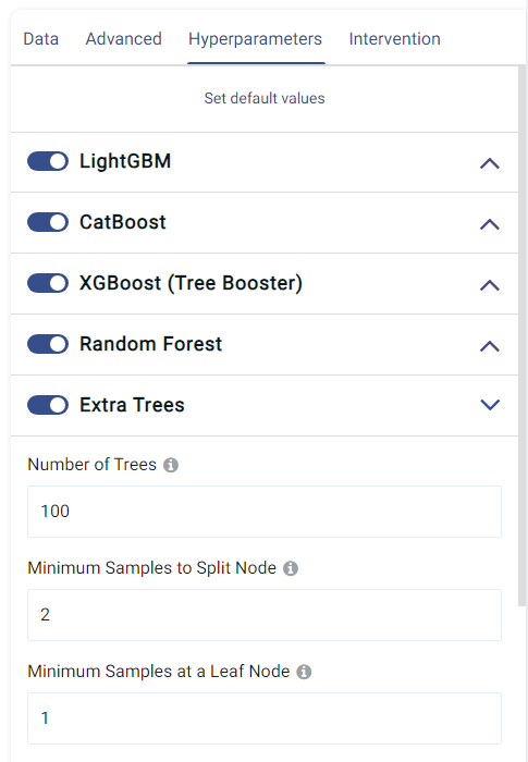
Hyperparameters tab:
This tab shows all the models that can be trained for classification. They can each be enabled o disabled by clicking on the toggle, and the individual options of each model can also be set.
The default values normally give satisfactory results, but these settings can be tweaked and adjusted to improve performance or adapt the model to any other constraints.
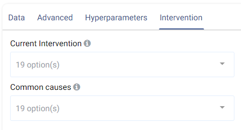
Intervention tab:
Counterfactual analysis can be performed to determine the effect of a treatment variable on the predicted outcome by setting the following two fields:
Current Intervention: Variables that cause the effect of interest, a.k.a. the current treatment affecting the outcome. It can be either numeric, Boolean, or categorical.
Common causes: Also known as confounders, these are variables that may affect both the treatment and the outcome variables. Selecting good common causes can help improve the results. Columns that have an effect on both the target and the current intervention should be included in this field.
A more in-depth analysis can also be made using Actable AI’s Counterfactual Analysis function.
Case Study
Note
This example is available in the Actable AI web app and may be viewed here.
Suppose that we would like to optimize a marketing campaign, by leveraging advanced analytics to maximize the Return On Investment (ROI). We could first perform a small-scale pilot campaign on a subset of potential customers to gather data which can then be used to develop a more targeted campaign and increase both conversion rates and the ROI.
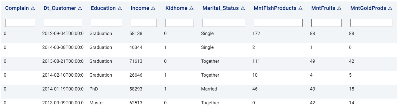
An example of the dataset could be as follows:
The parameters are set to the following:
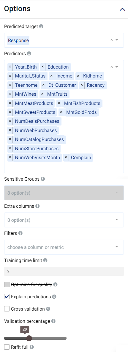
The rest of the parameters are kept at their default values.
Review Result
The result view contains the tabs Prediction, Performance, PDP/ICE, Leaderboard, Table, Live Model, and Live API, as follows:
Prediction
The Prediction tab shows the prediction result for the rows where the target value was missing. For multi-class classification, the category with the highest confidence is returned in red color in the <target_name> column, where <target_name> is the name of the target feature. In the case of binary classification, the returned class is the positive class if it exceeds the probability threshold (the probability above which a class is determined to belong to the positive class). For both cases, the probability for each category is also displayed, with one column for each class. This will be covered in further detail when the Details table is explained below.
Note
This tab is not visible if the data does not contain any rows where the target value is missing.
Performance
In the Performance tab, the performance of the trained model (i.e. the model’s ability to predict the correct values) is expressed using a number of evaluation metrics (where the maximal/best value is typically a value of 1), namely:
Accuracy: the number of correctly predicted samples out of all the samples. More information available here.
Balanced Accuracy: Similar to accuracy, but caters for imbalanced data.
MCC: Matthew’s Correlation Coefficient (MCC) is a measure of statistical accuracy and can be said to summarize the confusion matrix (discussed hereunder) by measuring the difference between the predicted and actual values. The MCC score is high only if the predictions are good across all classes.
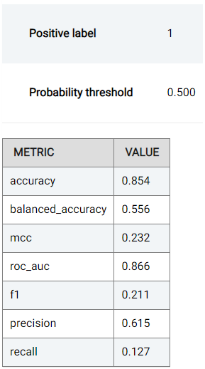
For binary classification tasks (when the target has only 2 distinct values), the following are also shown:
ROC AUC: The Area Under the Receiver Operating Characteristics Curve (ROC, detailed below) can be used to summarize the trade-off between the True Positive Rate (TPR) and False Positive Rate (FPR).
Precision: Determines the percentage of predictions (when the predicted value is the positive class) that are correct. More information available here.
Recall: Also known as sensitivity, recall determines the percentage of predictions (when the ground truth is the positive class) that are correct. More information available here.
F1: The F1 score combines (and thus can be said to summarize) the precision and recall scores. More information available here.
Two plots are also shown, as follows:
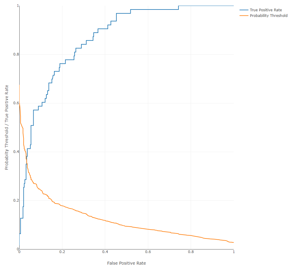
Receiver Operating Characteristics (ROC) Curve: a plot that shows the trade-off between True Positive Rate (TPR) and False Positive Rate (FPR). In the case of binary classification (when only two classes are present, namely a positive class and a negative class), the True Positive Rate is the percentage of data points in the validation set having positive labels (with a value of 1 in our example) that are correctly classified as positive. The False Positive Rate is the percentage of data points in the validation set having negative labels (having a value 0) that are incorrectly classified as positive. For multi-class classification, the ROC is plotted for each class where the class under consideration is considered to be the positive class. Given that we can choose a different probability threshold to classify a data point as positive or negative (default is 0.5), the TPR and corresponding FPR values are dependent upon the chosen threshold. One might find a trade-off between TPR and FPR useful in different use cases. For instance, in applications related to security where the positive is considered to be a trusted identity, it might be desirable to minimize the FPR as much as possible lest an sample be incorrectly identified as trustworthy whereas in actuality the opposite is true.
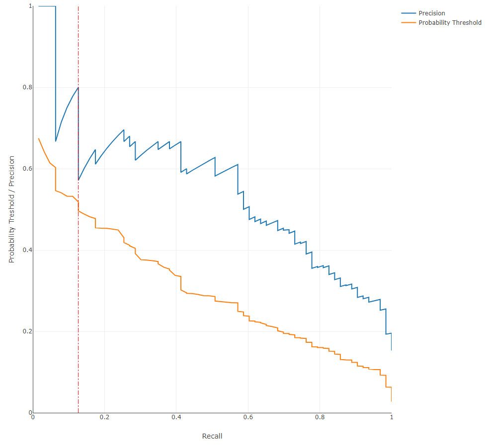
Precision-Recall Curve: a plot showing the trade-off between precision and recall at different thresholds. This curve can be used to determine the robustness of the model in predicting classes. For instance, a low recall but high precision indicates that the model may struggle to detect the correct class but is then highly trustable when it does, while a high recall but low precision indicates that a class is well-detected but the model also incorrectly assigns the label to many samples. The probability threshold above which a sample is determined to belong to the positive class is also shown, while the currently used value (0.5 by default) is marked using a red vertical line.
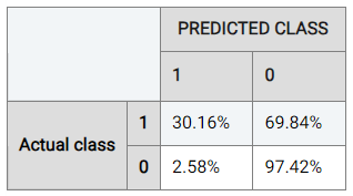
To understand the performance details in further detail, Actable AI also provides a confusion matrix as one of the evaluation metrics that can be used to break down and understand the results. The confusion matrix is computed from the held-out validation data set, and shows what percentage of data points in the validation set are classified into each of the categories present in the target feature. The below table shows the confusion matrix for our marketing campaign response classification example.
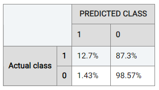
Considering the rate when the actual class is ‘0’ (the negative class), it can be observed that the model trained by Actable AI predicts the correct result 98.57% of the time, while the positive class is predicted correctly 12.7% of the time. This discrepancy in performance is likely due to class imbalance, where the data contains an unequal distribution of classes. In our case, there are more examples with a label of ‘0’ than with a label of ‘1’, such that the model may tend to prefer predicting values of ‘0’.
Actable AI offers tools to try and counteract this, such as the choice of the optimization metric as detailed above. For example, if we optimize for ROC AUC, 30.16% of samples predicted to be positive are now correctly predicted as positive (up from 12.7%). The performance for the negative class has has only dropped marginally in this case (to 97.42% from 98.57%).
Note
This example is available in the Actable AI web app and may be viewed here.
Actable AI does not only act as a model training tool, but also attempts to provide the rationale behind the classification of each sample. To this end, two tables are provided: the Important Features table and the Details table.
The Important Features table indicates the importance of the features (columns in the data) as deduced by the Actable AI algorithms during training. The p-value is also shown, which can be used to help determine if the null hypothesis should be rejected, with smaller values increasing the likelihood that the null hypothesis is rejected. The null hypothesis represents the case that there exist no statistically significant differences between two possibilities. In the feature importance table, lower p-values increase the certainty that the feature importance values are correct. In our case study example, variables
MntWines(the amount spent on wines in the last 2 years) andNumWebVisitsMonth(the number of visits to company?s web site in the last month) are among the most important features in predicting the customer response (for the trained model).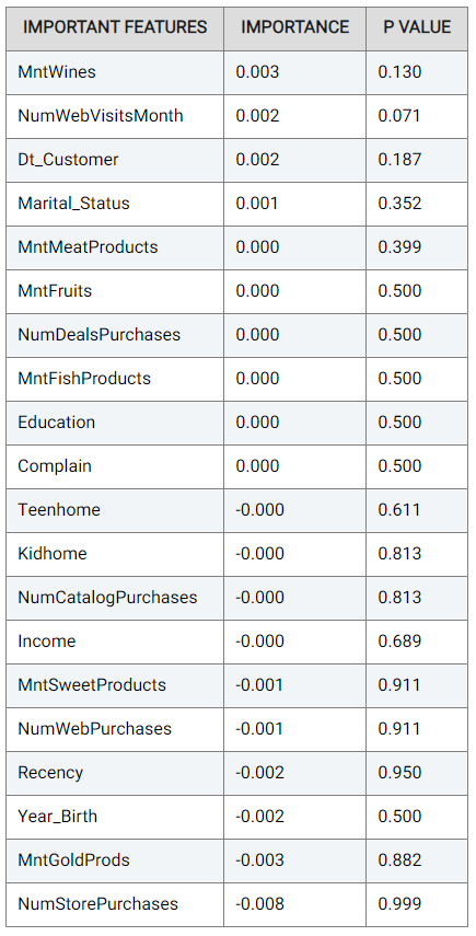
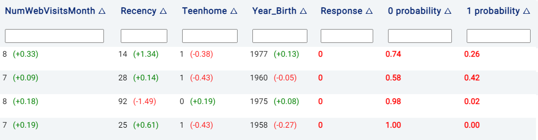
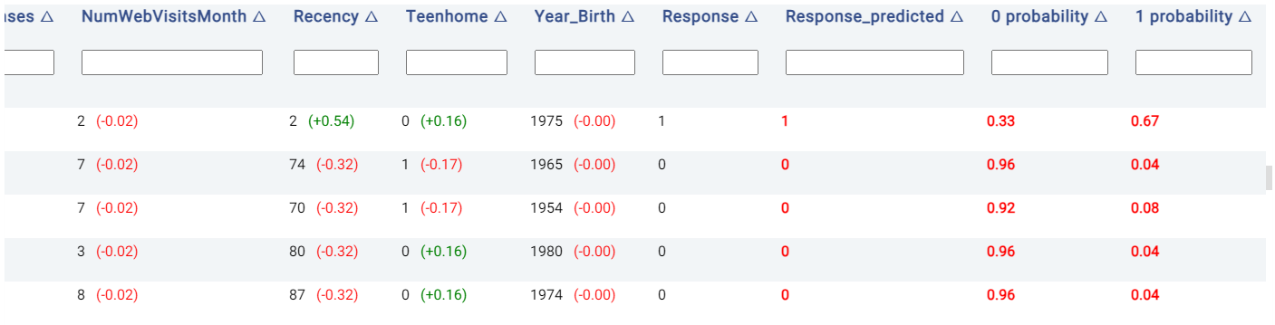
The Details table shows the classification decision, and also indicates the rationale behind the classification decision made in each row if the Explain predictions option is enabled. This option also appends several new columns to the original table, as follows:
Probabilities columns: The N columns
target_value probabilityindicate the probability of each of the N categories in being predicted, wheretarget_valuecorresponds to the class label. For example, in the below image, the model predicts that the customer in the first row of the table has a 67% likelihood of having a positive response.Prediction result: The column
target_predictedshows the predicted class, wheretargetrepresents the chosen target feature.
Moreover, the values to the right of each cell belonging to a predictor are Shapley values, which give an estimate of the contribution of a feature to the result. Values in red indicate that the feature decreases the probability of the predicted class (i.e. the one with the highest probability) by the given amount, while values in green indicate that the effect of the feature increases the probability of the predicted class.
PDP/ICE
Partial Dependence Plots (PDP) are powerful visualization tools that help you understand how specific features in our model influence its predictions. With PDP, you can easily explore how changing one feature impacts the outcome while keeping all other factors constant. More information can be found in the glossary.
Individual Conditional Expectation (ICE) plots complement the insights gained from PDP. While PDP gives an average view of the relationship between a feature and the predicted outcome, ICE plots enable the selection of a specific data point to observe how changing one feature impacts the prediction for that unique instance. In this example, each instance represents one customer. Hence, this enables us to see how the predicted marketing campaign success changes when a factor such as the marital status varies, keeping all other factors unchanged. More information can be found in the glossary.
Note
Only a subset of all samples may be shown in the ICE, if there is a large number of samples. This is done to reduce computational resources and make it easier to view the plots.
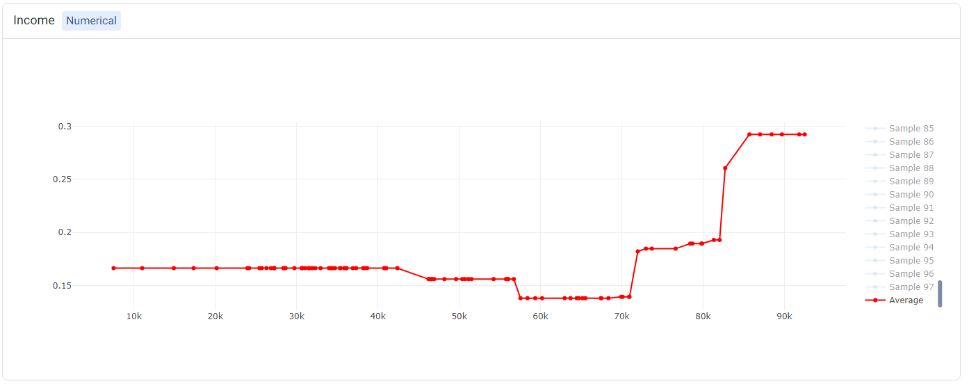
The PDP and ICE plots are provided for each feature. For ‘numerical’ features (such as Income), there is one plot containing (1) a line for each sample (representing the ICE plots), and (2) a red line representing the ‘average’ (i.e. the PDP).
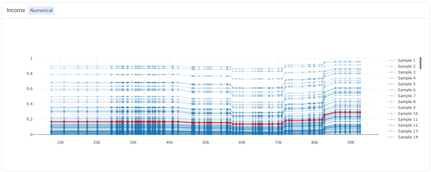
Tip
Double-clicking on any of the labels in the legend will hide the rest of the labels. For example, double-clicking on ‘Average’ (corresponding to the PDP) shows only the PDP.
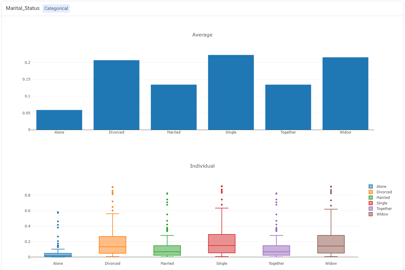
For categorical features (such as Marital_Status), two plots will be shown: (1) a bar plot, showing the ‘average’ values (i.e. the PDP plot), and (2) a box plot showing statistics of the ICE values.
Leaderboard
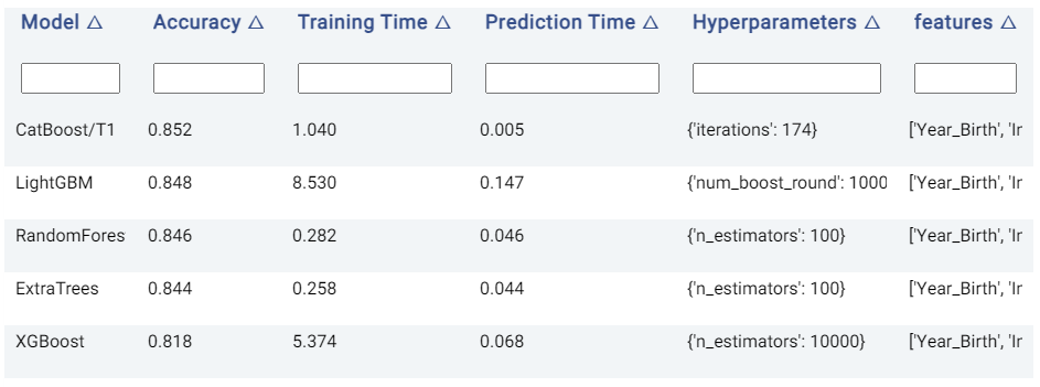
The Leaderboard tab shows the underlying models used to get a prediction. Actable AI uses state-of-the-art machine learning algorithms to get a prediction and then selects the best algorithm to get the final predictions.
In the provided table, an example of which is shown below, we can see the following information:
Model: The name of the model trained.
Accuracy: The validation score of the model (using the default accuracy metric). If another metric was used for optimization in the Advanced options tab (as detailed above), then this column will correspond to the chosen metric. Models are by default sorted using this metric (with the first model being the best-performing model), but they may also be ranked using the other columns by clicking on the arrows next to the name of each column (which toggle between sorting the values in ascending or descending order).
Training Time: The time taken to train the model.
Prediction Time: The time taken by the model to generate the predictions.
Hyperparameters: The hyperparameters used to train the model.
features: The features used by the model in performing predictions. This is particularly useful if Feature Pruning is enabled, to determine which features are actually used by the model in making predictions.
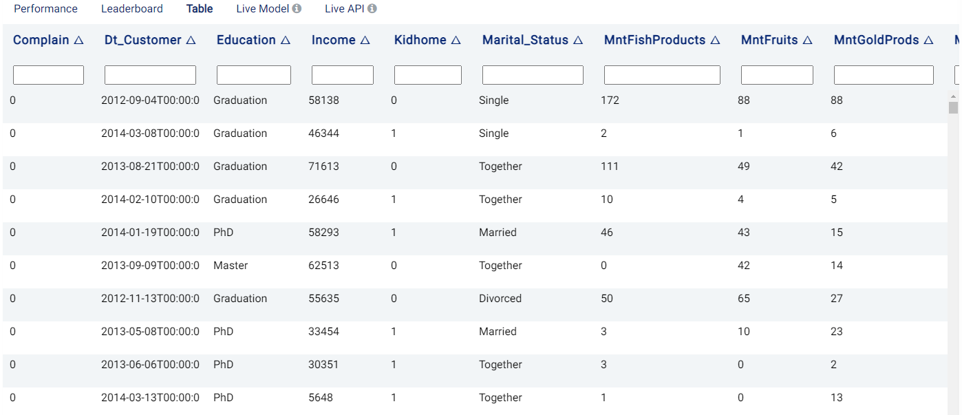
Table
The Table tab displays the first 1,000 rows in the original dataset and the corresponding values of the columns used in the analysis and any Extra columns:
Live Model
The best trained model can be used on new data, either using an uploaded dataset or by adding predictor feature values directly. If the Return Probabilities option is selected, the probability for each class is also provided in addition to the predicted class (i.e. the class with the highest probability). Moreover, for binary classification tasks, the probability threshold and the label to be used for the positive class (Positive Label) can also be adjusted.
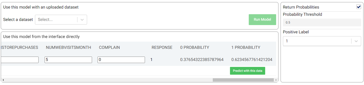
In the example shown in the above image, the new sample is predicted to have a positive response (‘1’) with a probability of 62.35%.
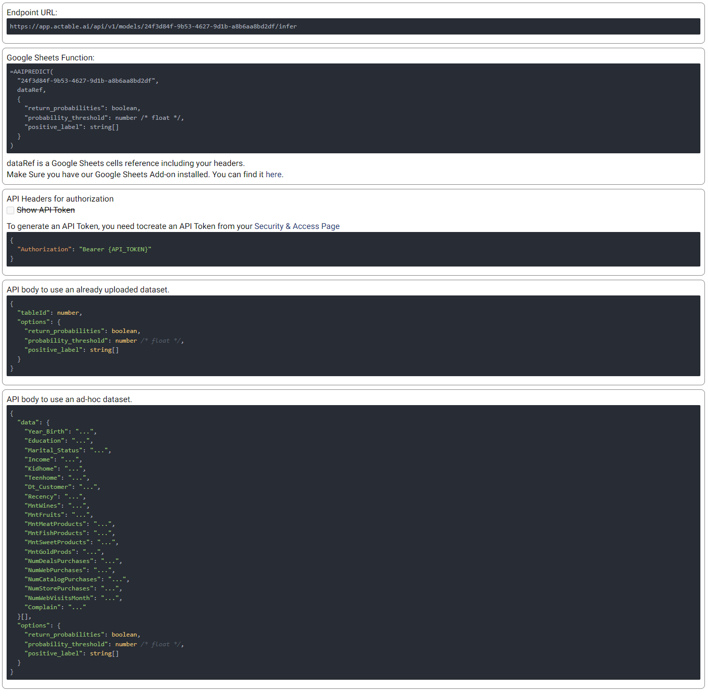
Live API
An API endpoint is also made available, allowing the generation of predictions in any of your existing applications (e.g. web app, mobile app, etc.). The available functionalities and details of the API are given in this tab, as shown in the example below: