Segmentation
Introduction
Segmentation is a clustering algorithm that groups similar data points into clusters, which can also be projected onto a 2D plane for easy visualization and interaction.
Deep learning is used to learn representations of the input variables and their interactions. Specifically, the Deep Embedding Clustering (DEC) algorithm is used to simultaneously learn:
A mapping from the high-dimensionality space of the data points to a lower dimensionality space
The cluster centers (known as centroids) such that each one contains samples having similar characteristics.
This is done by employing an encoder network to yield the feature representation in the low-dimensional embedding space, where the parameters are learned by minimizing the Kullback-Leibler divergence between a centroid-based probability distribution and self-trained auxiliary target distribution, where the similarity between each sample and a centroid can be said to correspond to the probability of assigning the sample to the cluster. DEC was shown to attain state-of-the-art performance, is robust to hyper-parameter settings, and its complexity scales linearly with the number of data points such that it can be used for large datasets.
Examples of segmentation include identification of potential customer segments to enable different marketing strategies which can be designed to target different customer groups, or clustering different transactions to help with fraud detection.
Parameters
There are two tabs containing options that can be set: the Data tab and Customize tab, as follows:
Data tab:
Number of clusters: The number of groups that data points will be grouped into, which should typically range between 3 and 20. You can also use
autoto let our algorithm pick the number of clusters for you.Colour: Values used to select the color for data points in each group. The default value is
cluster_idwhich is the identification number of the created groups. In other words, the color of the data points will be determined using thecluster_id. One can pick a categorical variable from the list of input variables.Selected Features: Input variables used for segmentation.
Explain predictions: If selected, the Shapley values (which indicate the contribution of a feature on the result) will be displayed.
Displayed columns: Used for visualization. The selected values will be displayed when placing the mouse cursor over the dots in the scatter plot. Changing this value immediately updates the scatter plot.
Size: Used for visualization. Define the radius of the displayed data points. Changing this value immediately updates the scatter plot.
Extra Columns (optional): Columns that are not in the predictors but will be displayed along with the returned results.
Filters (optional): Set conditions on columns to filter in the original dataset. If selected, only a subset of the original data will be used in the analytics.
Furthermore, if any features are related to time, they can also be used for visualization:
Time Column: The time-based feature to be used for visualization. An arbitrary expression which returns a DATETIME column in the table can also be defined, using format codes as defined here.
Time Range: The time range used for visualization, where the time is based on the Time Column. A number of pre-set values are provided, such as Last day, Last week, Last month, etc. Custom time ranges can also be provided. In any case, all relative times are evaluated on the server using the server’s local time, and all tooltips and placeholder times are expressed in UTC. If either of the start time and/or end time is specified, the time-zone can also be set using the ISO 8601 format.
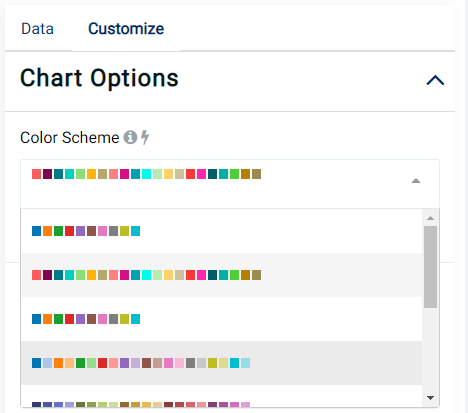
Customize tab:
The color scheme used to display the clusters can also be changed, as shown in the image below:
Case Study
Note
This example is available in the Actable AI web app and may be viewed here.
Suppose we are analyzing some data related to credit card usage, and we would like to segment customers based on this data.
An example of the dataset is as follows:
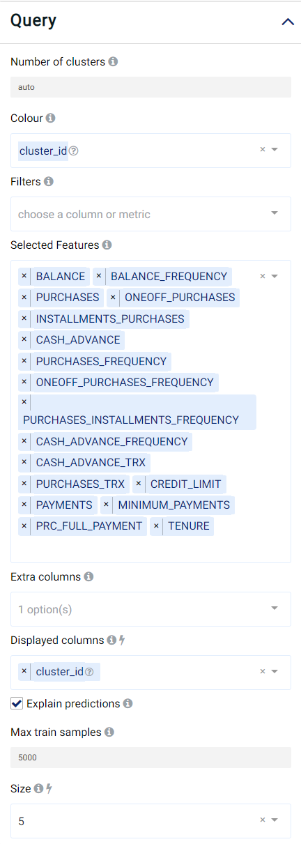
We set our parameters as follows:
Review Result
The result view contains a Chart tab, a Clusters tab, a Data tab and a Table tab.
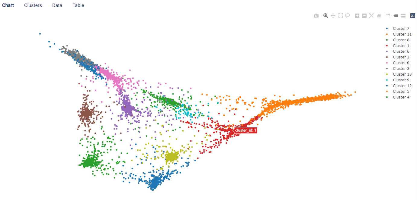
Chart
The Chart tab displays a scatter graph, where each data point represents an individual row in the original chart.
Each cluster is displayed in a color according to the group in which it was assigned. Moreover, placing the mouse cursor on a point displays the features selected in the Displayed columns field.
The following image shows that, for our data, the algorithm automatically clustered the data into 13 different groups.
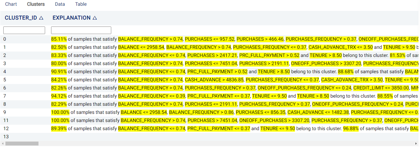
Clusters
The Clusters tab displays the decision behind each cluster. Specifically, the features and thresholds used to assign a sample to each cluster are shown, along with the percentage of samples satisfying these criteria.
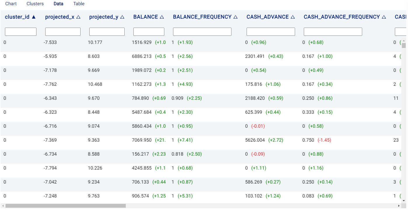
Data
The Data tab shows the features used in the segmentation and also provides some additional information:
cluster_id: The cluster to which the row (i.e. a sample) is assigned.
projected_X, projected_Y: 2D location coordinate (\(x\)- and \(y\)-coordinates, respectively) of the data points in the chart.
If the Explain predictions option is selected, Shapley values are also shown to the right of each cell belonging to a feature, giving an indication of a feature’s contribution to the outcome. Values in red indicate that the feature decreases the probability of the predicted outcome (i.e. the one with the highest probability) by the given amount, while values in green indicate that the effect of the feature increases the probability of the predicted outcome.
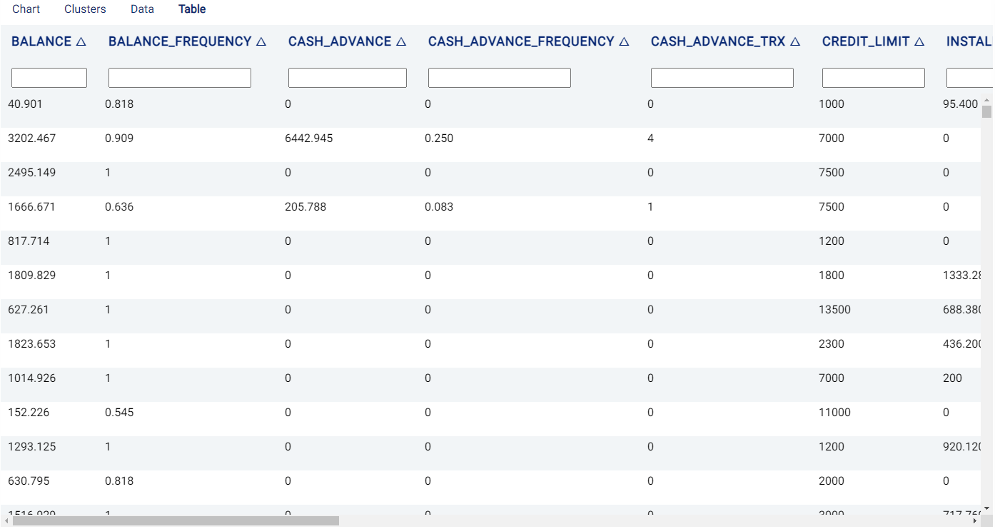
Table
The Table tab displays the first 1,000 rows in the original dataset and the corresponding values of the columns used in the analysis: